Friday, 26 February 2010

Photo Shoot for Diesel campaign...

During the planning of outfits and set up on set I took photos of the photo shoot unfolding...
These photos are of the planning that went into the models outfits for the shoot.
These photos are of some ideas which were put together pre-shoot to possibly include in the photos.
This is a photo of the models pre-shoot.
This is a photo on the right is of Anna with the camera getting ready to shoot some photos.
This final image is of what could be seen through the camera lens.
(All the images were taken on my Blackberry, hence the bad quality.)

Wednesday, 24 February 2010

General Update on Project 4.

After a meeting yesterday our group has finally set some ideas in stone.
We've decided to scrap the whole letters idea. We're going on the 'sex sells' route for our campaign. This means lots of leggy shots. Instead of having letters featuring in every shot we are going to place the Diesel logo on the model/mannequin legs, maybe even on the accessories.
For the backdrop for the photos we wanted to go with an 'industrial' look which gives the sense that Diesel is returning to its textile roots. We have chosen 6 final locations for our shots.
(Scanned image).

We have got the studio booked for tomorrow morning. The plan is to either have the backgrounds projected onto the wall in the studio and put the models in front of it or to take photos of the models/mannequin legs in the studio then photoshop them on to the background later.
Tomorrow morning is going to be all about experimentation. We are going to see how it looks and then decide on what we think looks better. Who knows something might happen as an accident in the studio which may look better than everything we've planned so far.

Monday, 22 February 2010

Test Shots for Project 4.


(Images all taken myself, with the input of Lauren & Anna)

We have realised that these photos are now completely useless because they don't work as part of a campaign. This is because if you saw a photo with just one letter on it you wouldn't know it was advertising Diesel. It's not until all the letters are together you see they spell out Diesel. The adverts wouldn't be shown page after page in a magazine so this idea is irrelevant. Although these photos are pretty useless they have spurred on some ideas. We could possibly use some of the letters in industrial settings and photoshop them together with the more glamourous model photos to spell out the whole word 'Diesel.'

Sunday, 21 February 2010

Idea for Project 4.

I've just had an idea for the Diesel campaign project.
Instead of trying to somehow make 3D letters for the project to photograph in front of architecture making letters out of pairs of jeans (seeing as they're mainly a jeans company).
I have taken some photos of what the letters would look like if they were made out of jeans.
(Images all taken by myself)
I still need to see what my group think of this idea.

Friday, 19 February 2010

Decisions for Project 4.

Our group has decided on an idea for our Diesel campaign for Wallpaper magazine.
We have decided to go with an idea which incorporates the legs influence of Guy Bourdin, who influences Mert & Marcus.
We are going to make the shapes of the letters to spell out 'Diesel' with the use of models legs. For some of the letters we are going to have the letters strategically placed in front of/around architectural structures. This falls in line with the Wallpaper magazine side of the project in that it is a not only fashion but design based magazine.

I'm currently thinking on how to make the letters. I would like to make them out of card and wrap them with 'Wallpaper' (reference to the magazine). This will also make the letters stand out against the background (colourful, influenced by Mert & Marcus).

Test shots will be up shortly...

More General Research for Project 4.

Just some more general research for project 4.
The first photo I found shows how the location for a photo shoot doesn't have to be really glamourous. A simple location for a photo shoot can work so long as the backdrop suits the garment. The beige background compliments to beige garment.
(Image taken from Elle magazine & scanned in)

The second image I found shows how not all on set photo shoots have to be shot with a plain white background. A coloured background can be used as long as, like on location photo shoots, the background suits the garments being photographed.
(Image taken from Elle magazine & scanned in)

Finally another image which I found shows how post-photo work can enhance an image. The graphics on this photo are what makes the photo special. This photo is by Nick Knight.
(Image taken from Vogue magazine & scanned in)

Tuesday, 16 February 2010

Mert & Marcus Research for Project 4.

Mert & Marcus are the photographers that our group have chosen to mimic in our photography.
Here are some examples of Mert & Marcus's latest work taken from magazines.
(All images taken from Vogue, Elle & Company magazines & scanned in)
These are perfect examples of how Mert & Marcus focus on colour in their photographs. These photographs also highlight the lack of accessories that Mert & Marcus use on their models in the shots. It is also known that the photographers like to get involved in hair & make-up before shoots. This is shown particularly in the second image which is an advert for Miu Miu, where the models make-up is very key to the image.

Research into Photographers for Project 4.

The next photographer I decided to look at was Mario Testino.
His book in the library, 'Portraits' proved very helpful. The book is made up of many portraits he has taken.
(Photos scanned in from Mario Testino's book 'Portraits')
His style for these photos is very unique. They're taken from a selection of photographs titled 'London.' It's almost like he's the person at the party who is taking all the photos. They are still very glamourous shots but the looks are still achievable by the average looking human being.

Research into Photographers for Project 4.

I decided to begin my research into photographers by looking at David Bailey.
He was contracted by Vogue magazine in the 1960's. He is said to have help capture the 'Swinging Sixties' at its prime. He did a lot of work with idols of the Sixties such as The Beatles and models such as Jean Shrimpton.
(All images scanned from David Bailey's book - David Bailey : archive, 1957-1969)
A lot of Bailey's work was done in black & white. The images above are some of Bailey's typical work. The top 2 images were taken from Bailey's 'Box of Pin-ups.' The third image is of model Jean Shrimpton.

More Diesel Research for Project 4.

I have just stumbled across the latest Diesel campaign 'Be Stupid' on their website.
http://www.diesel.com/be-stupid/
(All images downloaded from Diesel website - www.diesel.com)
These are just some of the images taken from the campaign. This campaign shows the quirkiness of Diesel as a brand. It shows their humour and the fact they do what they like.
For this campaign Diesel put out an appeal on their website for people to send in videos of themselves being stupid. These videos were then translated into images for the campaign shots.

Monday, 15 February 2010

Diesel Research for Project 4.

I decided to begin my research by looking into Diesel as a brand.
I found a book in the library - Diesel: World Wide Wear.
The book is very useful in giving information about the brand identity of Diesel and how they work.
The book begins with this quote from Renzo Rosso who was is the founder and owner of Diesel.
The quote states that they do what they like and never do things just because they're supposed to.
The fact that they do what they like shows in their controversial 'Historic Moments' campaign which they describe as giving an unusual slant on 2oth century politics.
This campaign also ties in with the fact that Diesel is said to communicate on 2 levels. Often seemingly contradictory with the first level being amusing and sexy and the second being ideological and thought provoking.

They also made a 'Successful Living' campaign which is said to include Diesels' sense of humour, sense of irony and finally sense of fun.
Diesel also does campaigns for kids. Diesel refuses to treat kids as though they are a separate species. As with adult collections 'Diesel Kids' follows it's own course of research, development and image.
Diesel's target audience therefore stretches across both male and female of all ages.

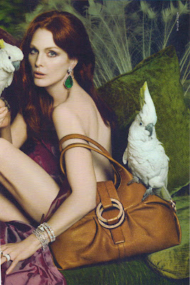
(All images scanned in from 'Diesel: World Wide Wear' by Ted Polhemus)

Research for Project 4.

For this project I have 3 main topics I need to research :-
- Diesel. (Brand identity, previous styles of campaign & target audience).
- Wallpaper magazine. (Style of magazine, target audience & purpose).
- Mert & Marcus. (We were asked to choose a photographer/photographers that we liked the style of to mimic for our photos. As a group we then decided on 5 aspects of their photography which we need to include in our own. The 5 aspects we chose were, the importance of colour in the photo, the importance of the appearance of the model, simple styling (not many accessories on model), set design (lots of thought put into positioning of props, model etc.) and lots of post production work is another key feature (photoshop).
- Other photographers. Even though we are soley focusing on Mert & Marcus' style for our project it is also important to look at other photographer styles to get a broad knowledge on how photography can be used in different ways to capture different emotions and situations. Also how it is used for different purposes e.g. advertising etc.

Thursday, 11 February 2010

Project 4

Yesterday we were given the brief for project 4.
The brief involves group work to design and take photographs for a brand campaign in the style of a certain magazine.
Our group at random selected Wallpaper magazine & Diesel as the brand.

I will be posting up research soon.

Alexander McQueen...

DEAD?!

BBC News have released a news story stating that prestigious fashion designer Alexander McQueen (Real name Lee McQueen) is dead.

He was found in his London home after police were called at 10.20 this morning.

Speculations that the designer took his own life have not been confirmed.

Adjustments to Big Freeze Presentation Board.

After todays final critique on the project I decided to make some adjustments to the final presentation board.
I decided to make the summary text smaller and make the title bigger.
(Photo uploaded from InDesign file)

Wednesday, 10 February 2010

Final Presentation Board for Big Freeze Project.

So here's the final presentation board after weeks of work.
(Uploaded from InDesign file)
I'm actually rather happy with the final turn out. Bring on project 5.

Presentation Board for Big Freeze Project.

Finally the last thing on the list of things to do for the 'Big Freeze' project.

I'm currently considering fonts for the presentation board. I'm wondering whether to go for a 'fancy' font which incorporates the 'Big Freeze' theme or whether to keep the board clean cut and use Helvetica.
Here are some of the fonts I tested.
(Uploaded from InDesign file)
The top 2 fonts I downloaded off the internet. After all this I've chosen to stick to Helvetica and keep my board professional and clean cut.

Storyboard for Big Freeze Project.

I've just realised that I forgot to blog about my storyboard before putting up my final images.

I decided to make my storyboard on InDesign and do it all digitally rather than attempt to draw, I think it will look a lot neater this way. Although I can't avoid the fact that I am going to have to sketch the final images out on the board. Drawing was never my strong point.

Here's the final storyboard.
(Uploaded from InDesign file)
The empty white boxes on the left are for the sketches of the final images.

Wednesday, 3 February 2010

Final Images for 'Big Freeze' Project.

(All photographs are my own)

These are the final 3 images which I have chosen to feature on my presentation board for the theme 'The Big Freeze.'
The second 2 images have been photoshopped for effect which ties in with the story I am trying to tell.
In the story the 'model' begins by wearing the garment with no outer clothing causing her to be very cold which is shown through the use of lighting in the photo, make-up on the model (very light foundation) and huddled up pose which is used.

In the second image the model decides to put on a chunky cardigan which she thinks will warm her up. The model is also in the process of walking which shows she is trying to warm up. The fact that the background is black & white but she is in colour shows that she is slowly getting warmer.

The final image which is all in colour and covered with a 'warming filter' shows the model huddled up in the cardigan. The warming filter gives the impression that the model is now warm.


Photoshop Work
For the second and third photos I felt as though they didn't line up on the terms of the model being the same size in each. I edited the third photo by using the clone tool to make the bottom of the image bigger and therefore make the model look further away from the camera and lined up with the second photo. This included cloning the footprints and everything, I'm impressed with how it's turned out!

Photographs for 'Big Freeze' Project.

As the snow began yesterday I spotted the perfect opportunity to get out and take some photos for the 'Big Freeze' styling project. I hadn't originally planned to include snow in the photos because there wasn't any around...obviously. When I saw the snow yesterday I got ready, grabbed the camera and headed for Greenhead Park, Huddersfield.

(All photographs are my own)